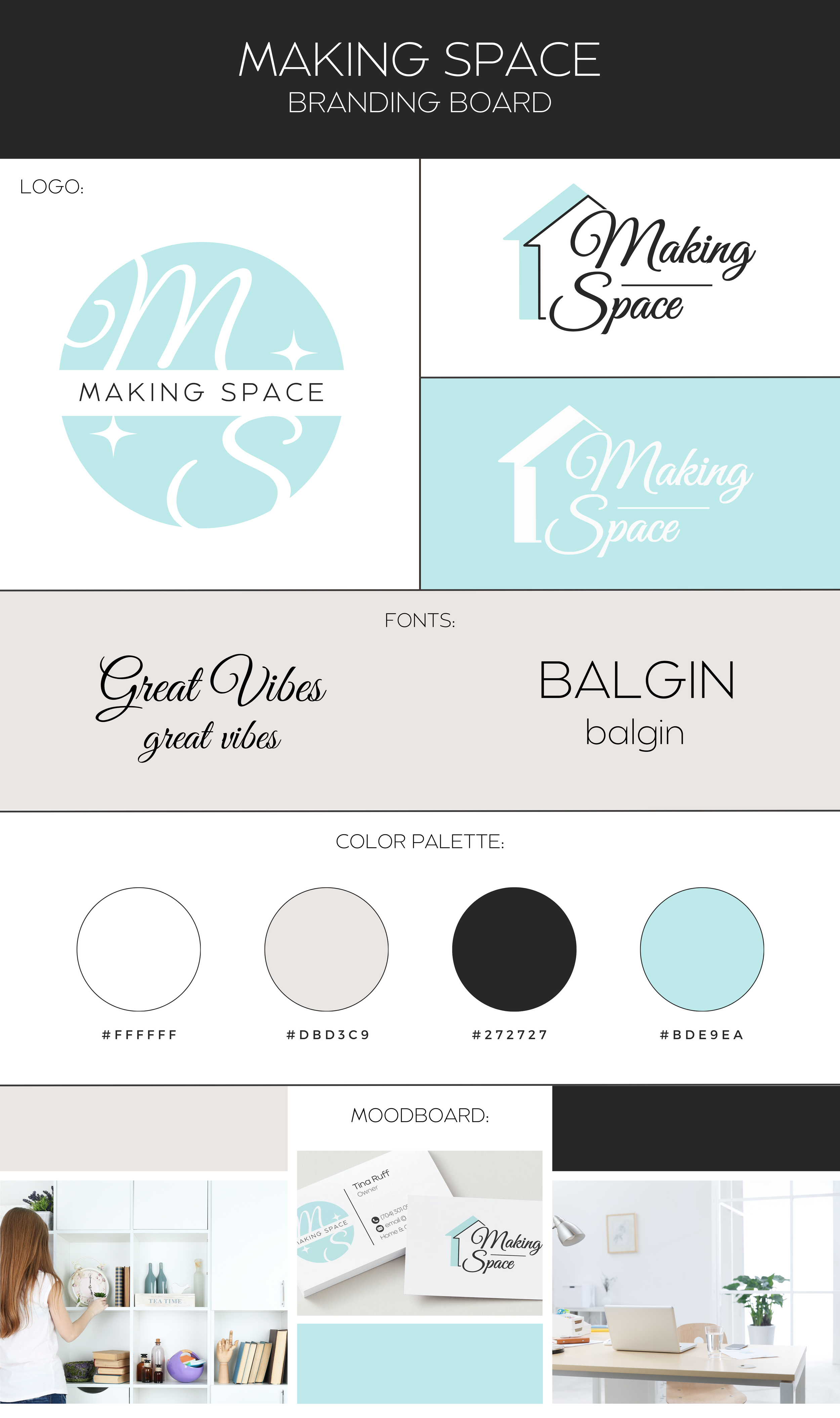
Making Space
Logo Design
I was commissioned to develop the logo and branding for Making Space, a new home and office organizing company.
The client requested a clean, minimalist logo using a turquoise-green palette. I delivered two complementary logo options—a primary and a secondary—maintaining consistent color and typography across both. This system allows flexible use of both logos while preserving cohesive brand recognition.


Branding
Once the logo was complete, I expanded the typography and color choices into a cohesive branding palette that could be applied to all future projects and media.
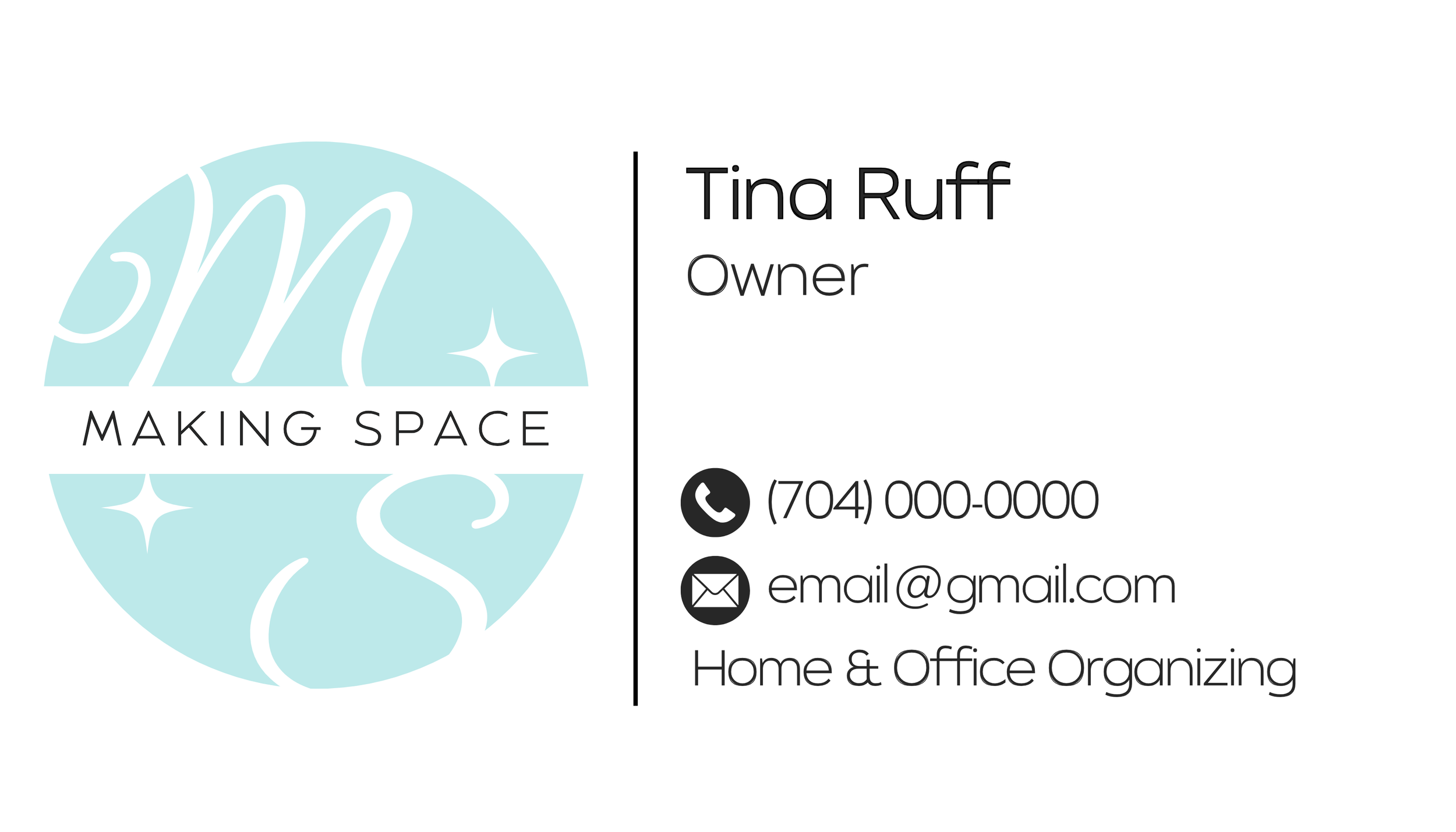
I then translated that branding into the design of the client's business cards, keeping a clean, simple aesthetic that feels professional yet approachable.
The use of bright colors evokes a fresh, invigorating space, the sparkle shape represents a sparkling, pristine finish, and the home shape reinforces the idea of the company coming directly to the customer.